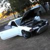
R35 Interior...ummmm
Announcements
-
Similar Content
-
Latest Posts
-
By MidnightR32 · Posted
Ah, fair enough. For the IAT, I'm using a legit GM sensor that was used on the car prior to my current build. I'll get another wideband and IAT ordered and follow up when they show up. Thanks for the help. -
You shouldn't need to massively fatten up the mixtures for cold conditions. For one thing - 0°C is not that cold. For another, the Haltech will be using the IAT sensor to tell it how dense the air air, and calculate the correct amount of fuelling. Then the cold start enrichment is added as a % on top of that, so it should scale with the main fuelling. You might also doubt the IAT sensor at this time. You're not using one from an RB26 are you? Using a nice Bosch sensor or similar? Happens. Some wideband units take great pleasure in killing their sensors. Put another wideband in the tailpipe and compare. Or just swap the sensor to a brand new one and see.
-
By MidnightR32 · Posted
Oh, my misunderstand. When the car was running, it sounded ok, but if I gave it any gas it wanted to die but caught itself afterwards. It's very different from how it was a couple months ago when it was warmer outside. The logs show that the AFRs are better during, what I assume, is warmup enrichment. Because it's cold, and air is more dense, should I work on the enrichment bit? -
By A31Skyline · Posted
yess of course im not using 2nd hand parts from my spare engine, but the place where i live is hard to find parts for the RB20DET ,but for the RB20E is everywhere including new ones and a lot cheaper ,because for the RB20DET you have to order it overseas to get one and it cost a lot of money 3x the price to be exact. so i ask this topic because if i can use the new ones but for RB20E is it compatible or not. if not im screwed haha, not totally screwed but i have to save a lot of money first before i can begin repairing my engine, thanks for the information before. -
By MidnightR32 · Posted
Unless my sensor just died, was only a couple months old, I strongly believe it didn't. How can I test it? I never mentioned it being 20:1+?
-


Recommended Posts
Create an account or sign in to comment
You need to be a member in order to leave a comment
Create an account
Sign up for a new account in our community. It's easy!
Register a new accountSign in
Already have an account? Sign in here.
Sign In Now