

Announcements
-
Similar Content
-
-
Latest Posts
-

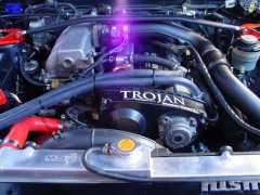
By joshuaho96 · Posted
This would be a new pump with new gears. I'm just unclear on whether it's a good idea to run more oil pump flow if you don't actually need said flow. Oil level is set a minute or so after shutting off a warm engine so wouldn't the high RPM oil level in the sump end up lower all things equal? Plan is OEM clearances, main concern in my mind is whether the OEM pump can keep up with the flow requirements of any additional oil coolers. -

By Dose Pipe Sutututu · Posted
Don't do what I did, use a 300000km old housing with billet gears. The old pump probably was clearanced with saw dust, Edward Lee's special engine treatment sauce and a good odo wind back. I had oil pressure issues, then replaces pump with new housing, new billet gears and 2x track day later binned a motor due to other oil related issues due to a previous engine builder. Long story short, buy a M2 or 3 or 4 N55/S55/S58 and enjoy life. -
 Yeah. "New pump" does not have to mean "massive pump".
 -
 Well, can you still get an OEM pump, and by the time you're buying a Nismo/N1 etc, just buy another aftermarket pump. It's better to have the pump able to flow more if its needed, than for your pressure to drop off. At any point in time, you're replacing the oil pump in a rebuild. Aftermarket pumps are likely going to be a better economical choice, and they don't have any negatives, even if they can flow more. Also, when you're saying "replace the pump gears" are you meaning leave a 25+ year old housing in the engine with unknown wear, and just put new gears in? As that sounds silly to me, especially if you do have that minute amount of wear, that means your new pump gears now have a little bit more clearance beside them, which means, whelp, you may not get to build a lot of oil pressure or make a lot of flow.
 -
By joshuaho96 · Posted
Right, but if you replace the pump gears + put a spline or sine drive gear on the crank on a Nismo/OEM/N1/etc pump at that point do you really still want more flow/oil pressure? Let's say this is a the aforementioned "keep it simple" build, no more than ~400 kW at the crank.
-


Recommended Posts
Create an account or sign in to comment
You need to be a member in order to leave a comment
Create an account
Sign up for a new account in our community. It's easy!
Register a new accountSign in
Already have an account? Sign in here.
Sign In Now